


The Idea
Brunei is much more than meets the eye. Instead of leaning into the traditional aesthetic, Ting suggested a different direction. She wanted something that could capture another side of Brunei that’s rarely seen, one that’s focused on the vibrancy and diversity of its people.
During exploration, the concept of postcards popped up. A personalised letter from a dear friend sharing the places they loved, is advice more trusted and cherished than a random internet anon. This idea inspired the visual direction of Brunei Weekender.

Brand Identity
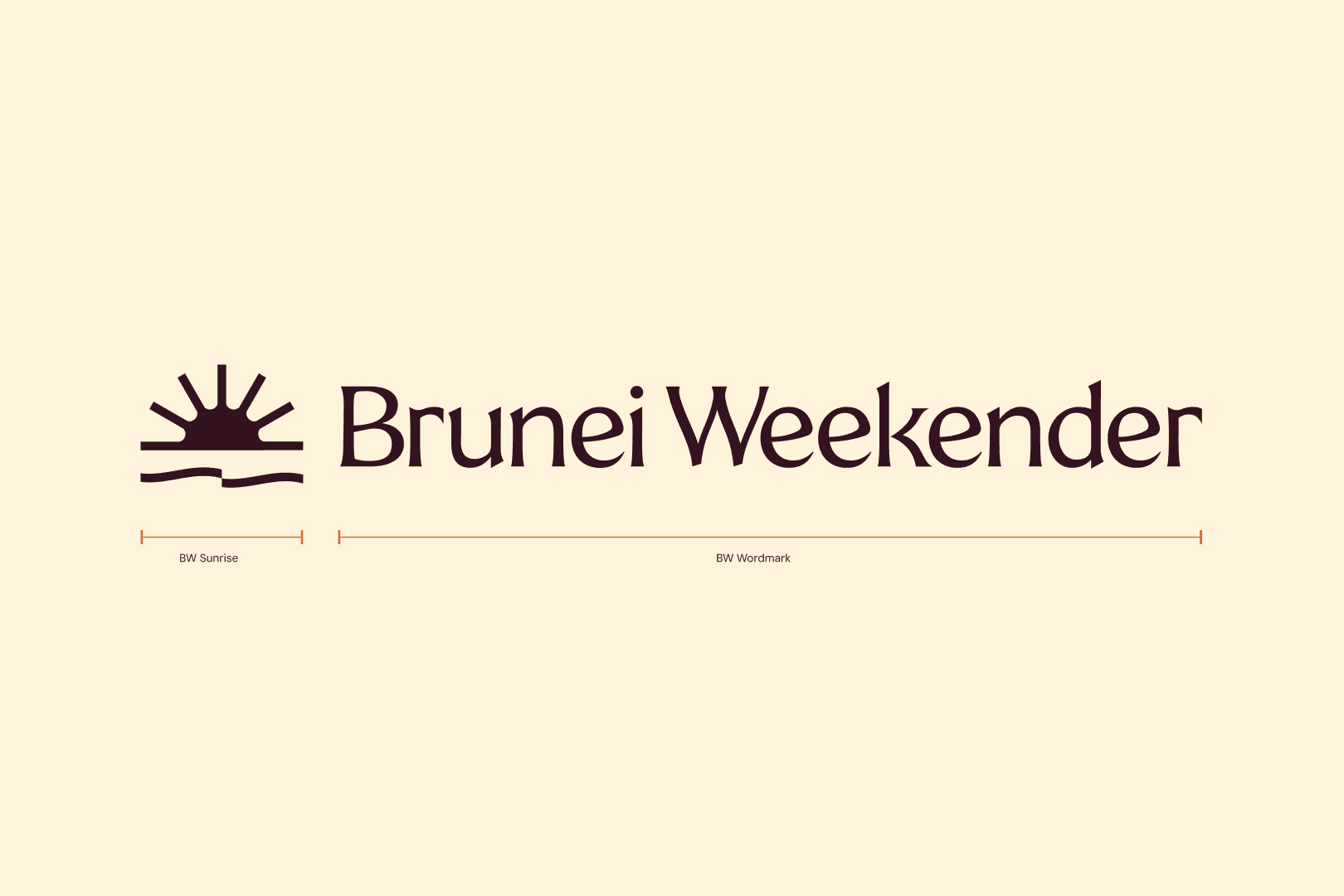
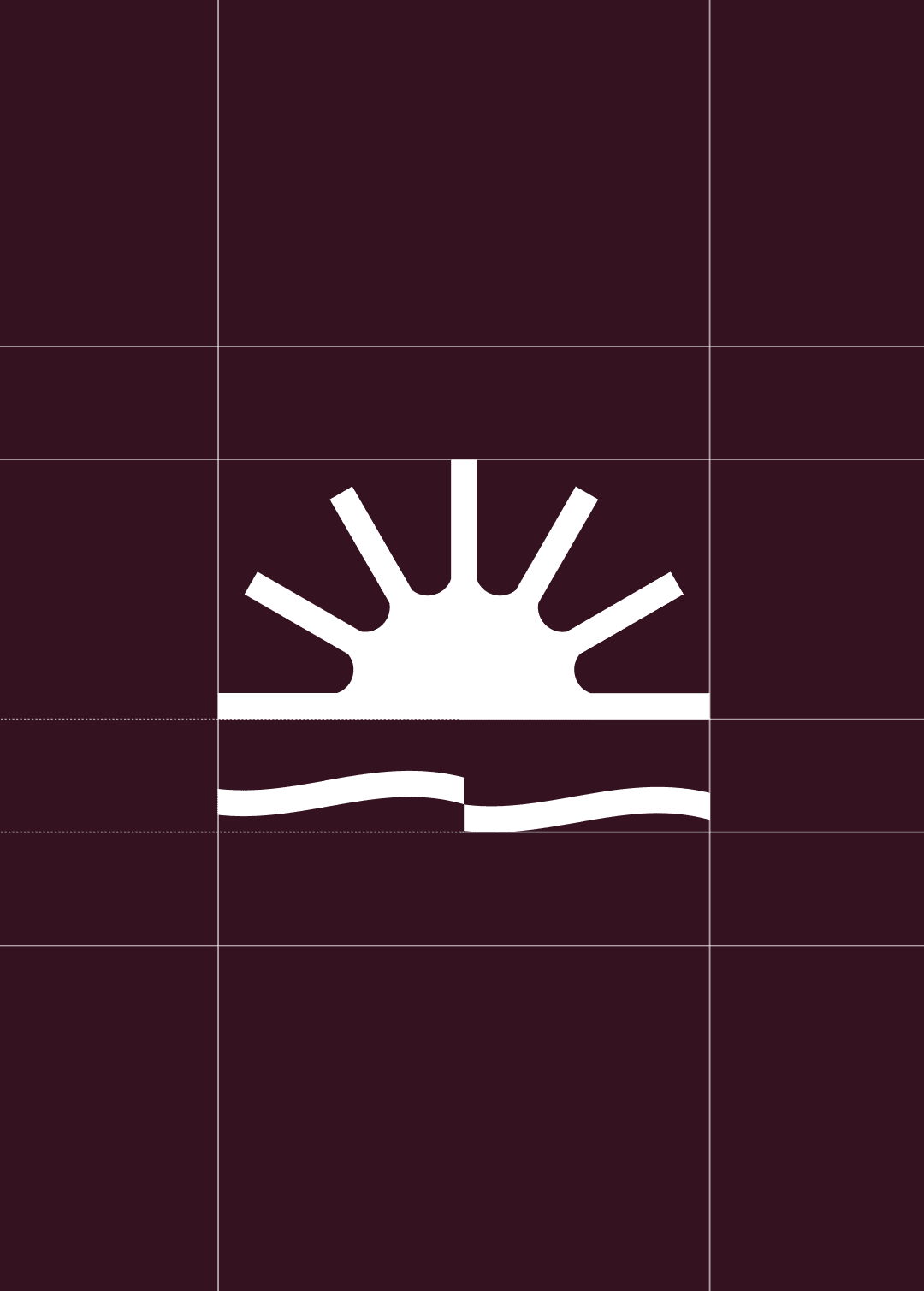
The identity system pulls directly from sights of Brunei. The brandmark, a sunrise that reflects the warmth of the people’s hospitality. The colour palette is pulled from the native flora and landscapes, capturing the energy of the city.
To elevate the brand, the typography was carefully chosen. Larken brings a fresh and authentic aura, balanced with DM Sans for modernity. And for that added human touch, Krikikrak.


Visual System
When pieced together in touchpoints like social media templates, the result is something that feels fresh, fun and approachable. Like friend that’s excited to welcome you to their hometown, Brunei Weekender aims to bring more authentic connections both among Bruneians and travellers alike.


Thank you!
Big thanks to Ting for trusting us with her vision! We're excited to see where the brand takes us.
Client: Ting Lei, Brunei Weekender
